Boho Flair
Home gets complete transformation
What was once a 1980s traditional cottage sits serenely among its counterparts on the tree-lined street of Thousand Oaks. Its footprint on the landscape remains the same, but a complete transformation turned this outdated home into a modern living space with splashes of the homeowner’s boho chic style.
The biggest adjustment for homeowner Stacey LaGreca is getting used to the home’s new open-concept living. “Everything has to flow,” she says. “I love it! I used to decorate little nooks as all the rooms in the house were closed off.”
When Stacey and her husband, Dr. Brian LaGreca, bought the house nearly two decades ago, they painted and executed a few touch-ups. “It just never felt right,” Stacey says. “I wanted to remodel years ago, but it’s hard to choose colors, flooring and everything else.”
They even discussed downsizing and moving, Stacey says, but the big question they faced was “Where were we going to go?” Determined to literally get out of the box of an outdated kitchen, Stacey called Designer Angie Freyenhagen. “I know Angie,” says Stacey, “so I called and said our kitchen was closed off. It was blocked off and I’d love for it to be open.”
Plans soon began to take shape, with the homeowners looking at the big picture. “It was ‘Let us show you what we can do,’” Angie says. “We opened it up and added windows.”
“We moved everything around,” says Jeremy Freyenhagen, owner of Freyenhagen Construction. “When you came in the front door, a small dark kitchen was on the left and a bedroom on the right.”
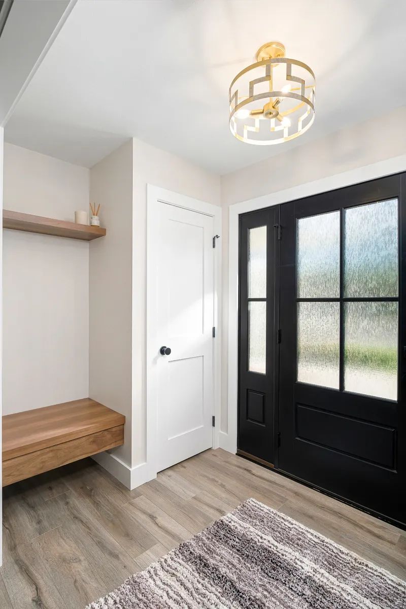
“We gutted the upstairs and made a new home,” Angie adds. “We created an entry at the front door with a big archway giving character to the main space.”
A floating wood bench and shelf strategically placed in the entry next to the coat closet extends an inviting welcome. A glassed front door with side panels dressed in lustrous black adds to the spectacular entrance. New black trim windows throughout the home create an impressive contrast with the freshly painted white exterior and black garage door. The interior is light with its subtle Drift of Mist color. “It’s so much brighter in here,” says Stacey.
“It’s an inspiring remodel,” says Aaron Reay of 406 Window Company. “We provided a new product called CityLine, a luxury product from Quaker Windows and Doors. The frames are powder-coated aluminum with profiling to simulate steel windows. And the Opti-Core insulation makes this window comfortable in the winter and in the summer. These windows look good and feel good.”
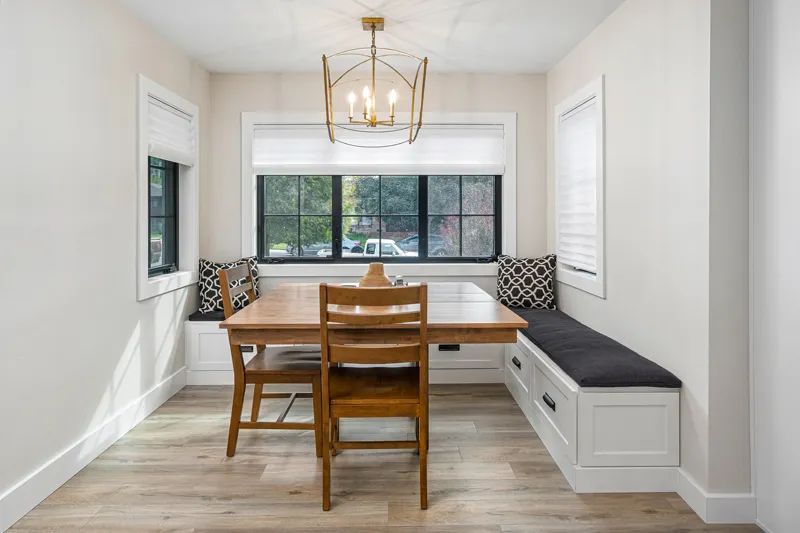
The stunning windows create a dramatic setting for the kitchen’s newly defined seating area. Custom white-painted maple benches form a cozy L-shape with black hardware giving the area a classy look. Topped with black upholstered cushions and decorated with black and white pattern pillows, the textured combination exudes a boho-style elegance.
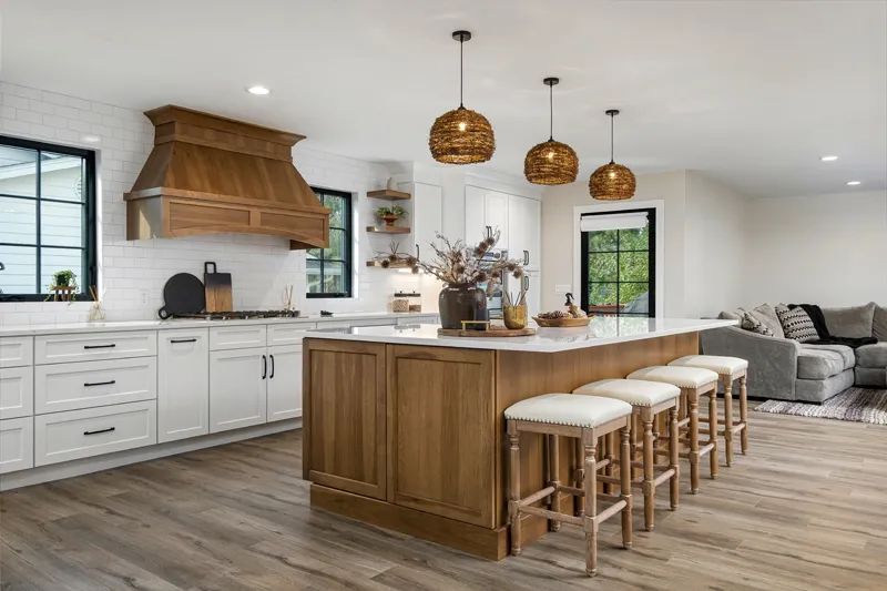
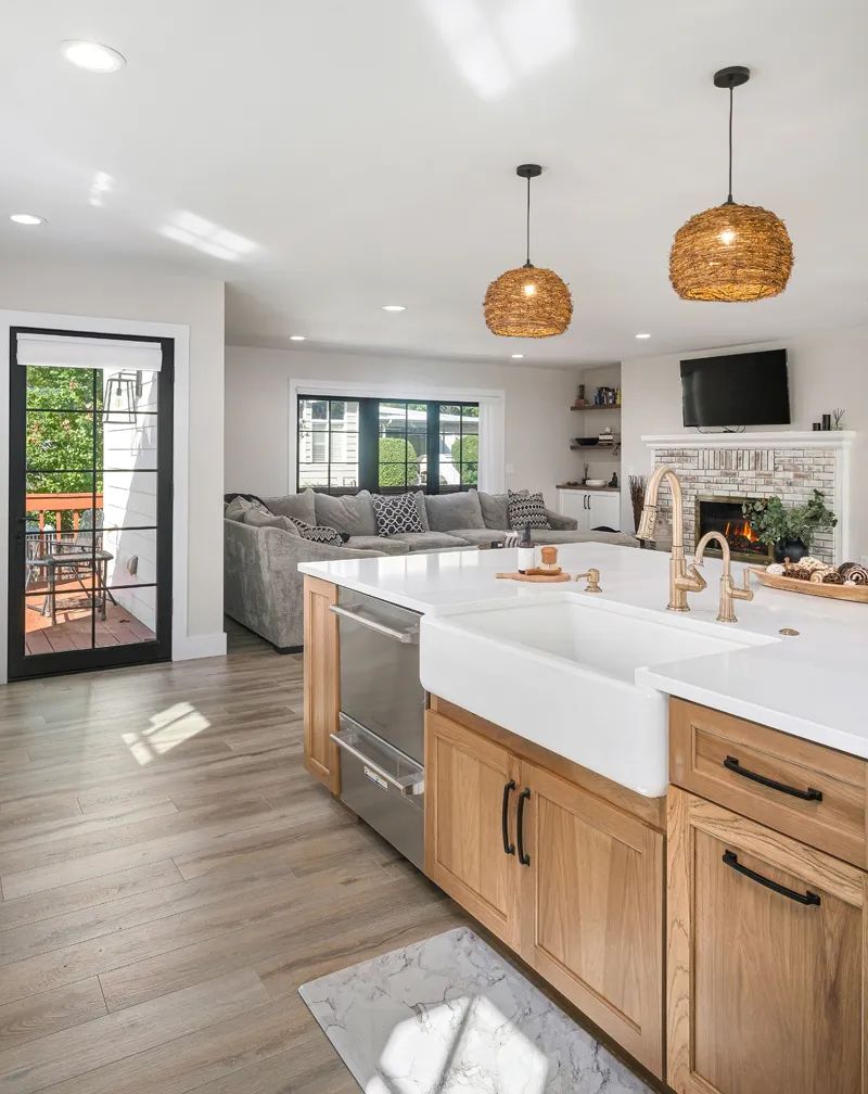
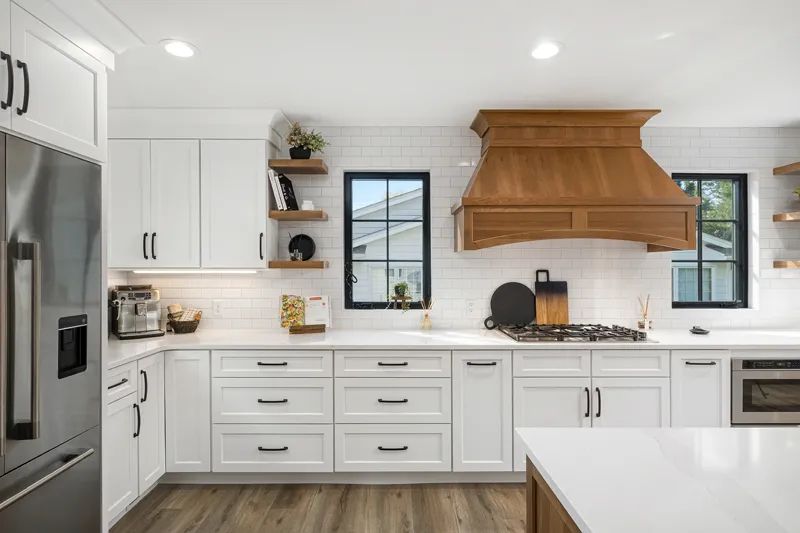
The open seating area mingles with the spaciousness of the kitchen. The airy atmosphere is not only comfortable but functional in its design. A grand size quartz-topped island from Fabricators Unlimited in dazzlingly bright white and highlighted with cool grey veins gives Stacey much needed workspace. “It’s expanded my cooking,” she says. “It makes me want to bake more. Before, I didn’t have the room, so it’s nice to have the extra space.”
The island’s hickory base, stained a light brown Fawn color, lends warmth. The warm color gives prominence to a large white farm sink accentuated with gold faucets. Wicker basket lighting over the island adds a fun element to this redesign.
A custom hood above the five-burner gas stovetop, along with floating shelves on either side displays the same Fawn-stained wood. White subway tile backsplash creates impeccably clean lines when paired with white-painted maple Woodland Cabinetry matching the benches in the seating area.
The formal dining area also sits at the front of the home on the other side of the entrance.
“We placed a Fawn column with soffit (architectural feature) here, which gives the dining area separation,” Angie explains. “The bookcases on the front wall on each side of the windows were updated, and to make the open space flow we placed a gold chandelier above the table.”
An exceptional piece of art adorns the main wall of this delightful dining area. Angie and Stacey agree that they “compromised with Brian” since it was his son Bryce’s metal work. Bryce originally crafted metal into a pot and pan rack. It hung over a small island in the old kitchen. The transitioned piece now covers the dining room wall.
“Brian and Bryce love it there,” says Stacey. “It’s creativity,” says Jeremy. “Every homeowner has something special they want to keep.”
“Our goal is not to displace anything or interrupt living space,” Angie says. This included Stacey and Brian staying in their home while the remodeling project was in full swing. “We redid the basement first,” explains Jeremy, “where Stacey and Brian lived while we worked on the main floor.”
“They made it so easy for us,” Stacey says. “They were also polite and very considerate of us downstairs.”
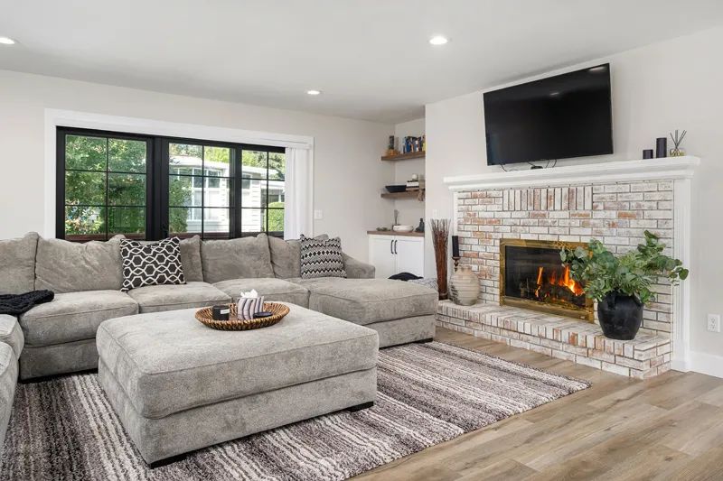
What also encouraged the homeowner to breeze through this major renovation was the help choosing the myriad of elements. Oak laminate flooring with a grey hue flows through most of the main floor, offering a foundation of quality and color. New mantles on the living room fireplace and a built-in corner cabinet with Fawn-stained top finish the living room area in refined splendor.
“Stacey and I spent time together and had everything picked out before the project started,” Angie says.
In Brian’s office, a Murphy bed for Jude, Stacey and Brian’s 5-year-old grandson, neatly tucks away in handsome cabinetry that matches the rest of the room’s furniture. Its peaceful ambiance allows Brian some quiet office time, yet in a second it changes to cozy sleeping quarters.
Nearby sits a luxurious guest bathroom. Shower walls bedecked in shimmering black tile surround a white tub. A double sink black vanity polished off with chrome fixtures creates a timeless, sophisticated look. “Stacey has great taste,” notes Angie.
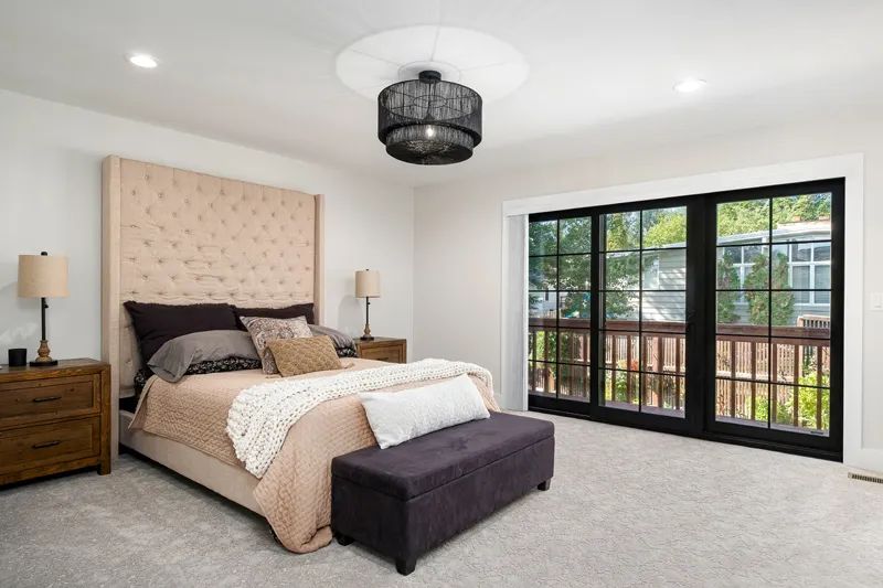
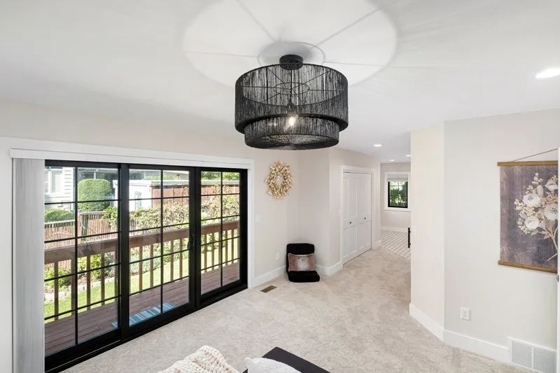
Great taste and boho flair flourish across the hall in the master suite. A transparent black chandelier juxtaposes eloquently with light-color walls and carpeting while black trim patio doors kick it up another notch.
After rearranging some walls and opening the space, the team created a walk-in closet. The closet door is a white barn door sporting black hardware. This extra punch of black color ties in nicely with black and white tiled floor in the open en suite.
“There used to be big tub in the corner,” Jeremy says. “We took some space to expand the shower and make a sitting area.
A glass shower strikes a gilded note with tiled walls and floor accented with gold shower head and hand-held attachment. A teak bench Stacey absolutely adores is a practical detail in this spa-like space.
It’s all in the details, according to Jeremy, and this newly revamped home reveals a multitude of them. It’s been a big step going from out-of-the-box to open-concept living, but Stacey and Brian are right at home entertaining family and friends.
The transformation on Thousand Oaks complements the homeowners’ lifestyle while harmonizing with Stacey’s vision of boho cottage flair.


