Timeless Design
Drawing on nostalgia to reinvent the family home
Stepping into John and Nicole Atkinson’s home, two words come to mind: elegant and approachable. It has to be. The couple has four lively girls ranging in age from 2 to 9, and it’s a safe bet that there’s never a dull moment in their home.
When asked about their style, Nicole admits it’s eclectic, drawing from antiques that have been passed down through both her and John’s family. There are splashes of color that give a nod to John’s artistic side. He’s an architect by trade but a painter at heart with a love for watercolor.

When the couple bought this 1979 home four years ago, it was a typical ’70s design — dark cabinetry, fluorescent lighting and fragmented rooms. While they admit it had a strong foundation, the character was lacking.
That’s not the case today. Their creativity and unique approach to putting cherished heirlooms on display is evident in every square foot of this well-loved home.
“John’s family is really into antiques, and when we first got married, we had nothing,” Nicole says. They gifted us furniture and that’s when I started falling in love with this look.”
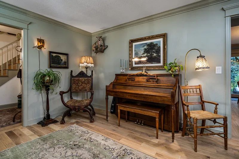
The gifted pieces aren’t your average hand-me-downs. They were antiques that might have had their start with John’s grandmother but now abide in the Atkinson home. There’s the brass lamp from Nicole’s mother that she adorned with a hand-sewn fabric lampshade, and there are ship-themed light fixtures. And who could miss the stuffed bobcat that stands guard over piano that used to belong to her mother?
“I love that European look,” Nicole says. “It’s old. It’s pretty. I don’t mind scratches and dents. I think that brings beauty and warmth.”
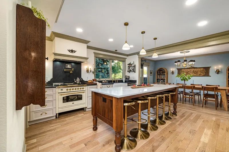
The heart of the home is where the biggest transformation has taken place. John and Nicole gutted the kitchen and lived on subfloor for a while as they worked out the plans for their neo-classical kitchen.
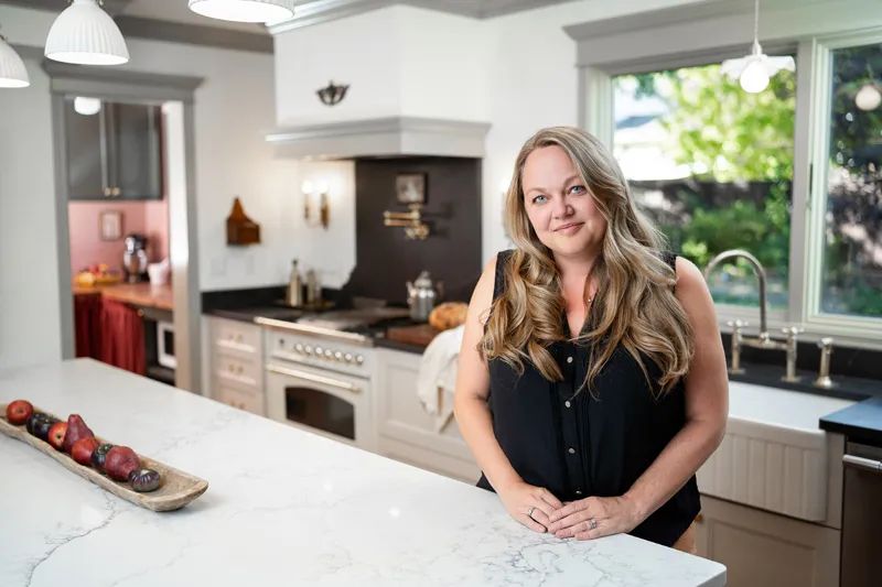
“They knew exactly what they wanted,” says Krystle Henry, an interior designer with Kitchens Plus.
John proves that point by flipping through images on his phone to show the final layout he sketched out by hand. It was one of 15 he played around with before handing the design reins to Krystle.
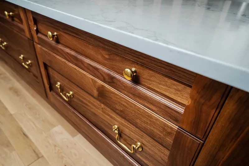
While Krystle embraced the layout and started dreaming up ways to bring it to life, she had to really engineer one of Nicole and John’s desires — a 10-foot floating walnut island outfitted with a power supply. The piece took on the look of furniture and would be topped with a 10-foot slab of quartz. The weight of the piece alone required a feat of engineering.
“To be able to suspend this distance with a solid surface quartz top, we had to get some structural support from below,” Krystle says. The result was a fabricated steel frame that’s hidden under the island. Since Kitchens Plus has its own shop, it designed, built and stain-matched the legs for the piece, drilling out a portion of one leg to run power to the island.
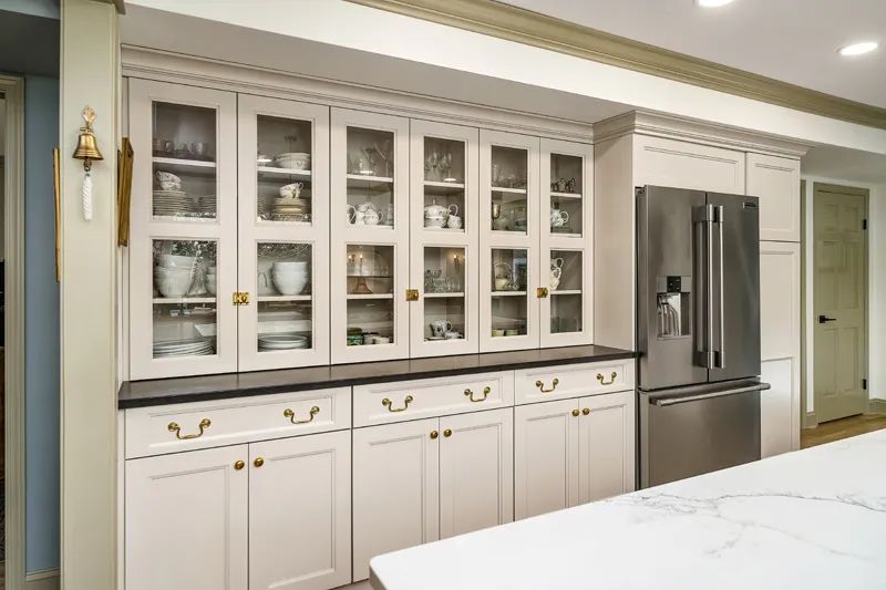
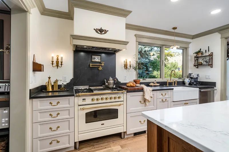
Another challenge was color. Nicole and John wanted anything but the typical white kitchen. They were drawn instead to warm shades of cream. Krystle ended up finding a cabinet that could be painted a custom color with the couple choosing Sherwin Williams’ shade known as Accessible Beige — a light tan with warm gray undertones. Instead of your average white trim, John chose a warm green for the room’s decorative crown molding.
“John always pushes me outside of my comfort zone with color,” Nicole says, giving her husband a smile from across the room.
It’s why the functional pantry is dressed in a dusty pink with maroon and green accents. This was where the laundry room once sat. Now, it’s a user-friendly storage area which houses small appliances like a microwave and toaster and has counter space for Nicole’s favorite cookbooks. Nicole created a curtain that hides what would otherwise be open under-cabinet storage.
“From a kitchen design standpoint, the functional pantry is trending, and I think it’s here to stay,” Krystle says. “It’s a place where you can keep a lot of that counter clutter.”
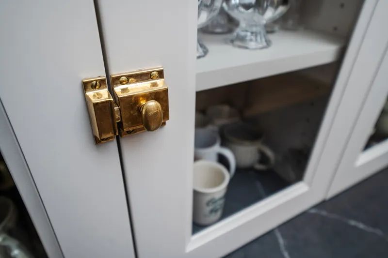
The entire space is reminiscent of a home you might have found decades, maybe even a century, ago in the French countryside. The built-in hutch displays the couple’s china and glassware. The recessed panel cabinets come with a timeless beveled edge and have the added charm of brass antique looking latches, knobs and pulls. There’s the large decorative porcelain farmhouse sink and an oversized window that gives a view to another of John’s hobbies — a large garden plot full of vegetables, fruit and flowers. At the center of this space, you’ll find quartz counters that mimic the look of both granite and soapstone.
“Soapstone is a really difficult product to maintain,” Krystle says. That’s why when the couple mentioned they wanted the look, Krystle steered them in the direction of quartz instead. “You have to oil soapstone on a regular basis and it’s very soft, so it scratches easily.”
The mix of it all creates a cozy, yet elegant feel. Nicole loves the looks of designers Jean Stoffer and Heidi Caillier, and often found herself drawn to their unique design styles.
“I feel like when I come into your home, I am walking into an antique shop in Paris,” Krystle says with a smile.
At the center of the kitchen, you’ll find the Italian Ilve stove. It’s a 36-inch dual fuel range with a timeless beauty. It offers heavy-duty cast iron cooktop pieces with the modern convenience of a true convection oven.
“I love to eat and so I love to cook,” Nicole says with a laugh. John adds, “She cooks a lot, and she is a really great cook.” As they say this, their four daughters are busy adding preserves to Nicole’s freshly baked scones.
Surrounding the oven is a custom-created scalloped backsplash that Krystle designed and, once again, looks like something from yesteryear.
In the corner of the kitchen hangs a brass bell that Nicole admits is an antique which she now uses to summon her girls for dinner.
“It’s a big house, and I don’t want to yell when it’s dinnertime,” she says. All four girls nod when asked if they love listening for the bell.
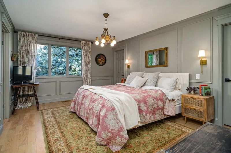
Upstairs, there is more of the family’s DIY handiwork. What was once a bedroom has been converted to a “schoolroom,” for Nicole and her daughters to home school. Walls were reconfigured in the master bedroom to make way for a walk-through closet and the master bath, which had been once open to the rest of the master bedroom, has been enclosed. A new tiled walk-in shower and a new vanity were installed as was a coved ceiling over the shower for additional character and charm.
“We have touched every surface in this house,” John says.
While the couple still has plans for the casual family room along with putting finishing touches on a main level half bath, they are taking their time. Every room in this home seems to have its own story, and for some rooms, that story is still being written.
In November, John and Nicole are headed to Paris and possibly London to celebrate their 15th anniversary. It’s a good guess they’ll come home with new and unique pieces to add to their décor, like the print John picked up at an antique shop in Scotland that adorns a dining room wall, or the National Geographic spread from the 1920s that sits framed in their formal living room.
It's a style that, in a way, defies definition. When asked to describe the look that has come together in the Atkinson home, Nicole and John nod as Krystle says, “I remember reading this somewhere: ‘Put what you love together and that is your style.’”
Nicole adds, “We like to make things our own.”
