A Sanctuary Designed for the Love of Home

The semi-circular pathway leading to the front door of Paula Roos and Steve Zediker’s home on Billings’ west end celebrates the serenity of nature. Captivated by the beauty of wildflowers expressing interest in the warmth of an afternoon sun, it’s easy to see why this married couple chose this particular spot on Poly Drive. It’s a lovely setting. And, a recent remodel transitioned this nice home from somewhat traditional to a spectacular haven.
“We needed a sanctuary,” says Steve, a massage therapist and accomplished musician who spends Friday evening’s playing Celtic music at Pub Mahon’s. “We also needed extra space to get away as there was no privacy.”
It’s now a habitat created where two working professionals relax and entertain friends and family, including their three grown children.
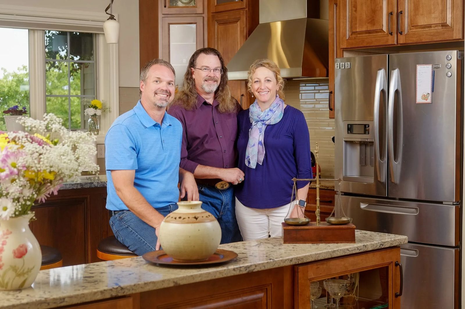
 L to R: Contractor Jeremy Freyenhagen with homeowners Steven Zediker and Paula Roos Zediker[/caption]
“We’ve been in the home two and a half years,” says Paula, an anesthesiologist and medical director of Patient Safety at Billings Clinic. “We realized the kitchen was too small after we had moved in. We thought about it and came up with some options as I have a big extended family. When they descend upon us, it’s all hands on deck!”
With their ideas in mind, the couple knew who to call. “We’ve been living here 23 years and Freyenhagen Construction is always around the neighborhood, plus, we’ve seen their work,” comments Paula. “I called and told Jeremy (Freyenhagen) we were in the house we love but the kitchen was too small. We gave him a long laundry list.”
Jeremy met with Paula and Steve, going over the ‘laundry list’ and their plans to enlarge the kitchen of this five-bedroom, two-level home with bonus room over the garage. As it ended up, Jeremy came back with the couple’s original plan and then some. “He showed us this plan which is awesome,” exclaims Paula, referring to the way their place has recently undergone a major metamorphosis.
Paula and Steve wanted a more functional kitchen and they wanted more storage,” articulates Jeremy. “The kitchen was at the back of the house with no direct access to the back yard. A small bathroom was also in the way. So, we moved the bathroom to where the kitchen was and relocated the kitchen.”
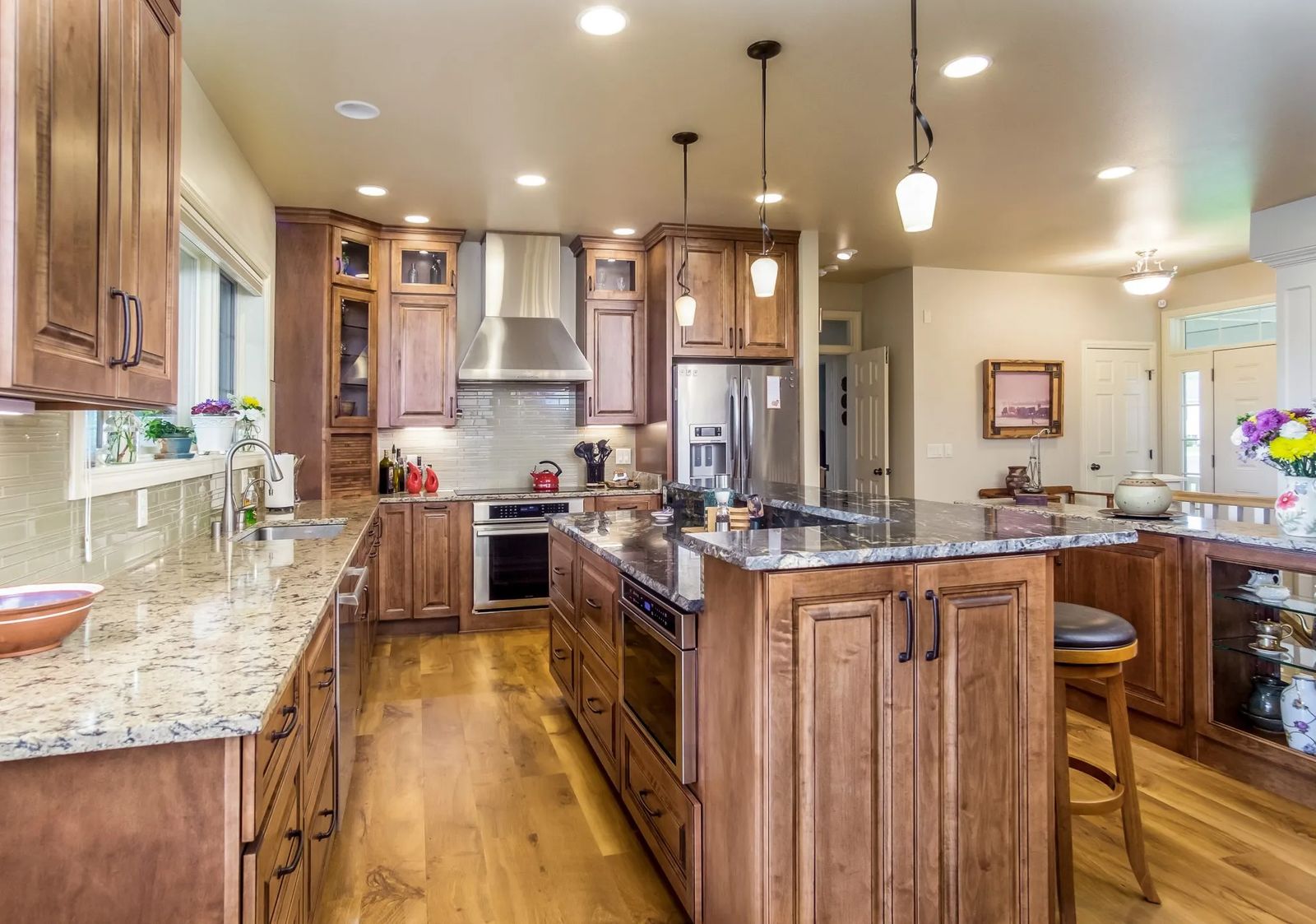
The once-diminutive kitchen looks, feels, and flows as the true heart-of-the-home since being repositioned into where the living room used to be. “It’s a more functional center of the house now,” adds Steve.
“It’s a different concept,” continues Jeremy. “Paula and Steve didn’t mind having the kitchen front and center. It works well with the rest of the space. It makes the kitchen feel inviting. It’s more of a living space.”
The open concept re-design kindles a peaceful, inviting sentiment to the main level. Soothing sounds of falling water crescendo the home’s harmony. An exquisite marble wall water feature provides separation from the French doors leading into the master suite and the newly transformed kitchen.
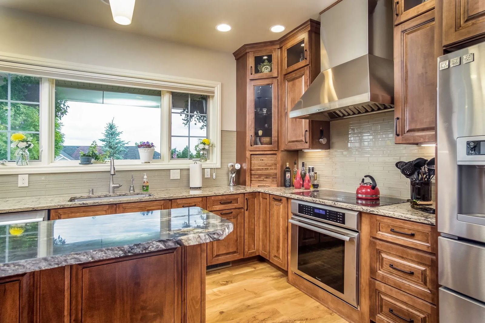
Cambria quartz countertops flow effortlessly along the perimeter of this updated area. “I didn’t want anything busy,” declares Paula, “I wanted the countertop to be the show.” A generously sized window runs above the sink and counters overlooking the patio and the backyard. It devotes a sumptuous view to the distant Pryor Mountain range, as well.
Hanging plants on either side of the window afford glimpses of nesting birds within the foliage. “We have house finch in the Fuchsia,” laughs Paula. “This is their third year here. We were never able to appreciate the view before.”
The view had been below par as the old window dropped nearly to the floor. This area used to function as the living room. “The old living room was big,” notes Steve. “We couldn’t enjoy conversation here. The fireplace used to be here,” he adds, gesturing to where a new stainless steel stove with induction cooktop from Ferguson Bath Kitchen & Lighting now stands.
Delicious maple cabinetry boasting Amaretto stain with ebony glaze, along with under-cabinet lighting, surrounds the stove and other stainless steel appliances. “The upper cabinets feature glass doors with lighting,” says Interior Designer Jennie Kolk of Freyenhagen Construction. “Paula and Steve had a clear vision on appliances and specific kitchen design. Entertaining is important to them with their kids.”
Accommodating every aspect of entertaining, a center titanium granite island with raised bar top bestows stunning appeal with its dark caramel veining. Three pendant lights from Rimrock Lighting drape gracefully above while the island benefits the homeowners with ample storage opportunities.
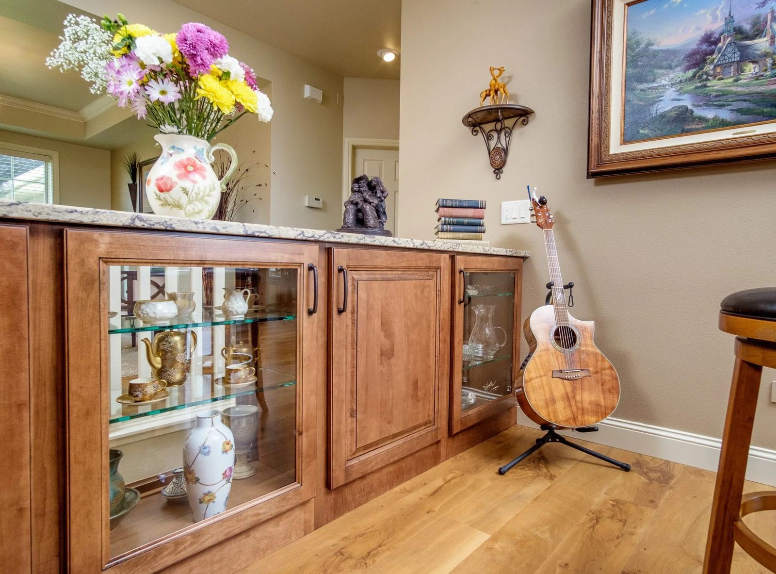
Storage ranked high on the ‘laundry list’ with this remodel. Additional storage was also designed along the side of the existing stairwell to the lower level. “Instead of a half-wall here,” points out Jennie, “it’s now a nice design element for Paula to display her pretty dishes and it allows for more storage.”
“I have all this china from both sides of the family,” shares Paula. “The idea here is having a lighted, glass bookcase on the ends of this buffet.” It makes for a brilliant idea as the piece ties impressively into the entire kitchen. This grand custom buffet minimizes the stairwell, too. “It’s safer than a hand rail,” mentions Jennie. It also imparts elegant subtlety to accord a bit of separation to the front sitting room, previously the formal dining area.
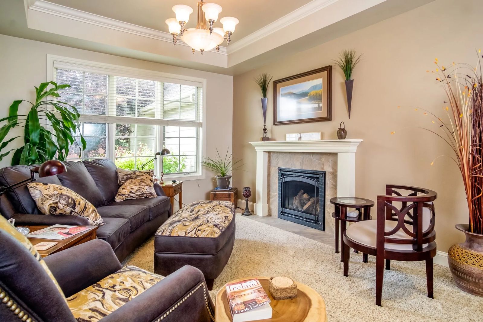
“The sitting room is a now nice place to sit and talk,” notes Steve. With the fireplace relocated to this space, grand ambiance fills the room. The fireplace’s classy modernization balances the room’s tray ceiling and fine leather and fabric furnishings from Conlin’s Furniture.
“Now the house is like it should’ve been,” exclaims Steve. It’s incredibly open but spaces are well defined. We can still sit in the front of the house in the sitting room and see the rims, and, in the back where we see the Pryor’s!”
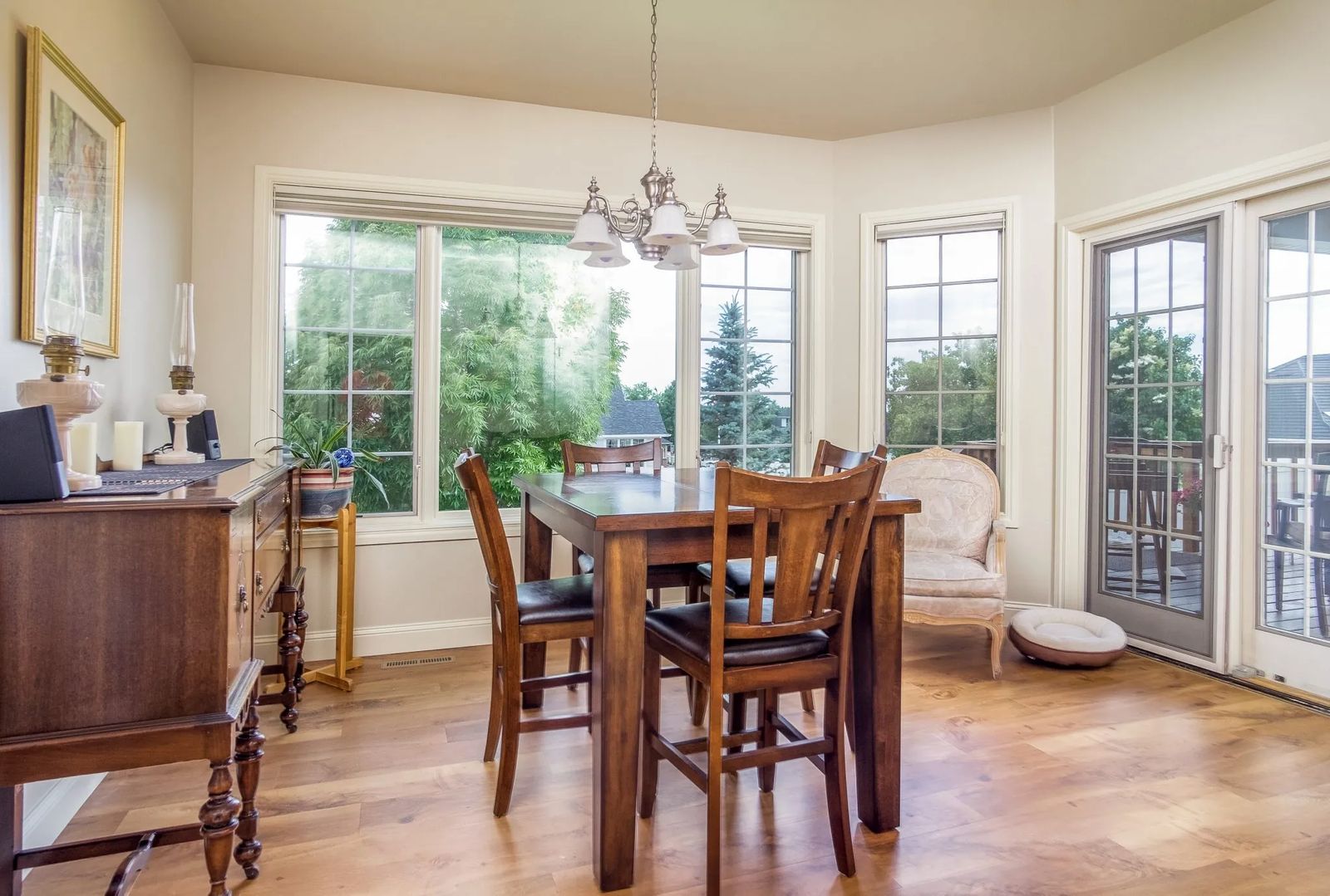
To the back of the home is the couple’s new dining space. Sitting just off the end of the kitchen, warm maple flooring from Pierce Flooring continues into this cozy eating area while natural light spills in through sliding glass patio doors. An easy access walk-in pantry has been included in the design, supplementing this major home re-do with even more storage.
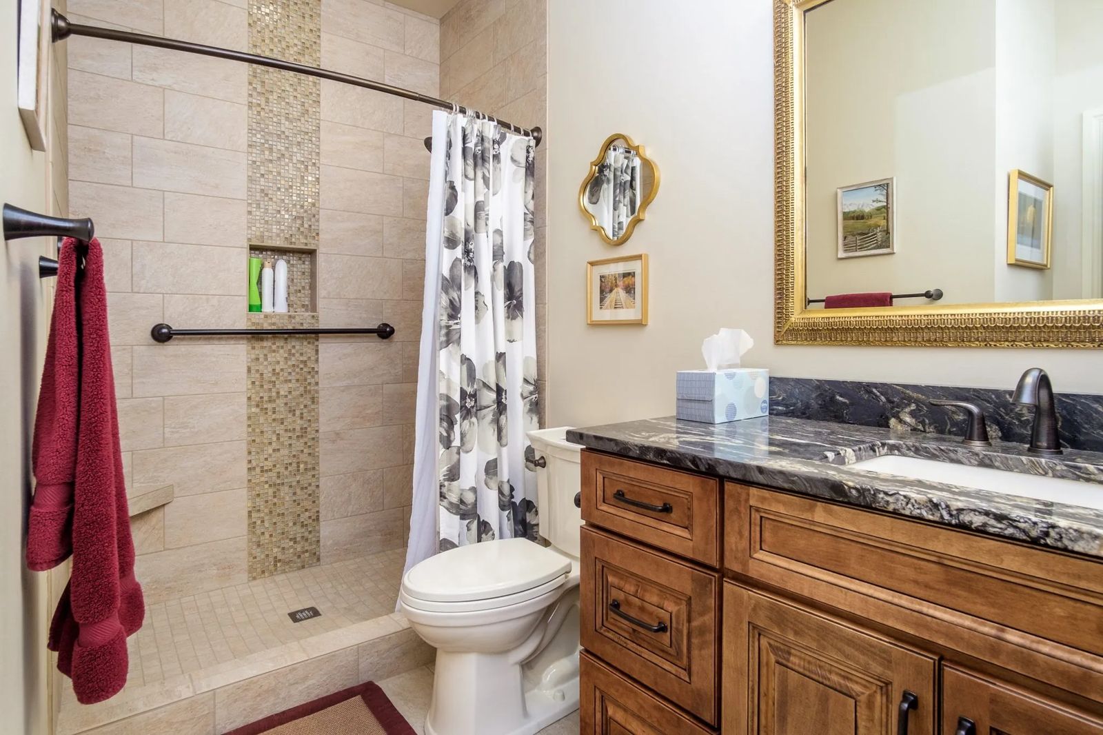
An extra bedroom located off the new dining space that the homeowners were reluctant to see disappear remains steadfast. However, a timeworn bathroom, the one ‘in the way of the kitchen’ was given relocation status next to the bedroom. Its makeover incorporates new Luxury Vinyl Tile (LVT) flooring and tiled shower walls and floor. “We call it the pretty bathroom,” smiles Paula.
The couple didn’t “skimp” on anything. Meticulous craftsmanship comprises the entire project as does new plumbing and electrical work. “Paula and Steve were receptive to design when talking about relocating space,” affirms Jeremy, which requires pre-planning and the necessary utility changes. “It’s how to merge it together.”
Paula and Steve’s revitalized home reveals warmth and character. It reflects their personalities. Functionality combined with comfort enlists a sense of calm, very befitting to those living here. A sense of purpose plays an integral role in transforming this couple’s beloved home into the sanctuary they’ve desired.
“We love our home,” confides Paula. “I think we’ve achieved it.”


